Big Visualization: Zoom
Displaying Big Data in Complex Visualizations can Simplify the Takeaway
Technological advances in the last 15 years have increased our ability to collect and analyze large amounts of data in more efficient and cheaper ways. This has resulted in the boom of “big data”—data sets that have increased volume, velocity, and variability. Volume refers to the amount of data being collected, velocity refers to the speed at which data is collected and used, and variety refers to the increasing types of data collected. All of these factors increase the generalizability of your results. However, the most common current data visualization techniques are not able to capture the complexity of interactions in big data sets. Simple changes in color and contrast, the amount of data displayed on the figure, and the range of the figure axes can make a huge difference in improving your data displays.
This article will highlight how the range of the figure axes can change how your reader interprets your data.
Oftentimes, large data sets result in a large range of data. It is important not to dismiss values at the extreme ends of a range as outliers if they are not statistically so, even though they may seem like it. However, trying to show a very wide range of data on a single graph can be difficult and may lead to certain values being under or over-represented due to the scale of the figure.
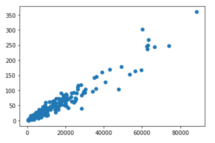
For example, this is a graph that shows cancer incidence in a country based on that country’s population size. Because the x-axis data ranges from 400 to 80,000, it is impossible to distinguish values below 20,000 from each other as a result of needing to reasonably fit the entire graph on one page. The majority of the data points are in the lower-left corner of the graph, but you would never be able to tell.
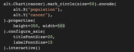
Adding zoom capabilities allows you to set the range of the x-axis in order to zoom in on certain segments of the data without having to transform or subset the data. One of the easiest ways to do this with a scatter plot is to use Altair, a visualization library for Python. The code below shows how I made a static scatter plot into an interactive one with one extra line. The first part of the code sets up the scatterplot, with the dataset defined after "alt.Chart," and the axes defined after “encode.” The middle set of lines set the chart size and axis label size. The last line “.interactive(),” is what allows you to zoom in and out on the data. Without that line, the graph looks the exact same, just without the interactive feature.
For experts, interactive elements allow them to get a more nuanced understanding of the data and all of the trends and connections that can be seen. For non-experts, interactive elements allow them to dynamically engage with the data in ways that make it more interesting to them, increasing the likelihood that they will seek out and understand new research. Complex visualizations can target both audiences at once, making your data accessible and interesting to a much wider audience.
When analyzing big data, use big visualizations to match the power of your data!
See my full code for adding dynamic zoom to a scatter plot here.
Post a comment