Big Visualization: Color
Technological advances in the last 15 years have increased our ability to collect and analyze large amounts of data in more efficient and cheaper ways. This has resulted in the boom of “big data”—data sets that have increased volume, velocity, and variability. Volume refers to the amount of data being collected, velocity refers to the speed at which data is collected and used, and variety refers to the increasing types of data collected. All of these factors increase the generalizability of your results. However, the most common current data visualization techniques are not able to capture the complexity of interactions in big data sets. This article will highlight some of the main challenges with simple data visualizations and will offer simple solutions to improve data displays.
Displaying Big Data in Complex Visualizations can Simplify the Takeaway
This article will highlight how color and contrast can change how your reader interprets your data.
Color, or lack thereof, is one of the most important aspects of a visual representation. Beyond being aesthetically pleasing, color serves to emphasize important data, group values together, and visually represent quantitative values. Therefore, it is crucial to select color palettes intentionally based on the type of data being displayed. In this example, we will look at antibiotic prescription rates per 1000 people by state from 2010 to 2019. The important takeaways from this data are:
- which states have the highest prescription rates per 1000 people, and
- are these rates increasing or decreasing over time?
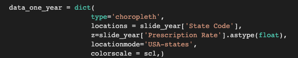
Because the data deals with states over time, I made a choropleth map of the United States. These maps use color intensity to represent data in a defined area. The map is defined in the “locationmode” function of the code shown below. In this case, we are looking at states, but you can also use countries, counties, or other specifically defined areas according to your data. In order to line up the data from the states with the map, you need the “State Code”, the two letter abbreviations for each state; this map will not recognize the full state names. Make sure that your data frame has all of the necessary elements that the graph will pull before trying to make your graphs!
Now that we have created the map, we can see how different colors change the initial meaning interpreted from the data. I used ColorBrewer2.0 to select the different color palettes seen below. On this site, you can choose the type of palette you want, the number of data classes (how many different colors you need), and show colorblind and print friendly options.
The first example, which contains a diverging palette of colors, focuses on one central value and represents values greater than and less than that central value as color “diverges” in both directions. This is not a useful way to show our data because there is no real value around which prescription rates center. In this case, the central value is the median of the data and the purple tones show rates less than the median value while the orange tones show rates greater than the median value. While this may be interesting in some cases, the median of the data changes every year since the rates change. Therefore, increases or decreases from the central value are arbitrary and do not answer either of our key questions.

The second example contains a categorical palette, in which each color represents a particular group of data. In the graph below, the “groups” of data are particular ranges of antibiotic prescription rates. Binning the data into random categories like this is unintuitive and does not allow the reader to understand the data at first glance.

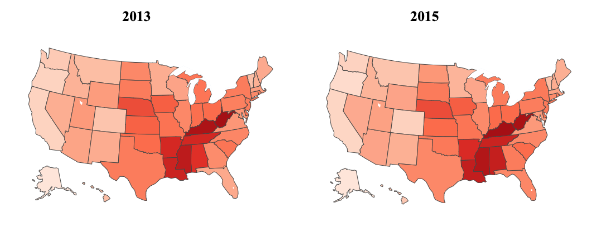
The third example uses a sequential palette, where the colors differ in intensity, but not in hue. This representation intuitively shows which values are greater (in magnitude) than others. Using a sequential palette tackles the first of our two main questions—it is easy to tell which states have the highest rate of antibiotic prescriptions per 1000 people. Note that I used a red palette for this visualization because red is typically associated with “negative” or “bad” things. Higher rates of prescription are bad because they lead to more antibiotic-resistant bacteria. Presenting the data in this way is very intuitive and allows the reader to quickly figure out which states have the highest antibiotic prescription rates.

Compare the two sets of graphs below. The colors on each graph show comparison between states within a year; darker states have the highest rates of antibiotic prescription in those years and lighter states have lower rates of antibiotic prescription. However, looking at the static graphs between the years 2013 and 2015, it is difficult to perfectly decode the subtle differences in color to determine if the antibiotic prescription rate for a particular state increased or decreased. If you look closely, Texas is slightly darker in 2013 than in 2015, and Florida is slightly darker in 2015 than in 2013. But for other states with even more subtle differences, you might not be able to tell unless you see movement where the colors change.
In order to represent change over time, we can add a slider that allows us to change the year and automatically and immediately see the color change across the map. This is an extremely useful tool because changes in color across years create contrast that is easy to see when the colors dynamically change in front of you.
For experts, interactive elements allow them to get a more nuanced understanding of the data and all of the trends and connections that can be seen. For non-experts, interactive elements allow them to dynamically engage with the data in ways that make it more interesting to them, increasing the likelihood that they will seek out and understand new research. Complex visualizations can target both audiences at once, making your data accessible and interesting to a much wider audience.
When analyzing big data, use big visualizations to match the power of your data!
Learn how to add a slider to your graph here.
Post a comment